Branding, Visual Identity, Graphic Design
Freelance Project
Date: 01. 2022
Simple , Bold , Stable , Honest , Responsible
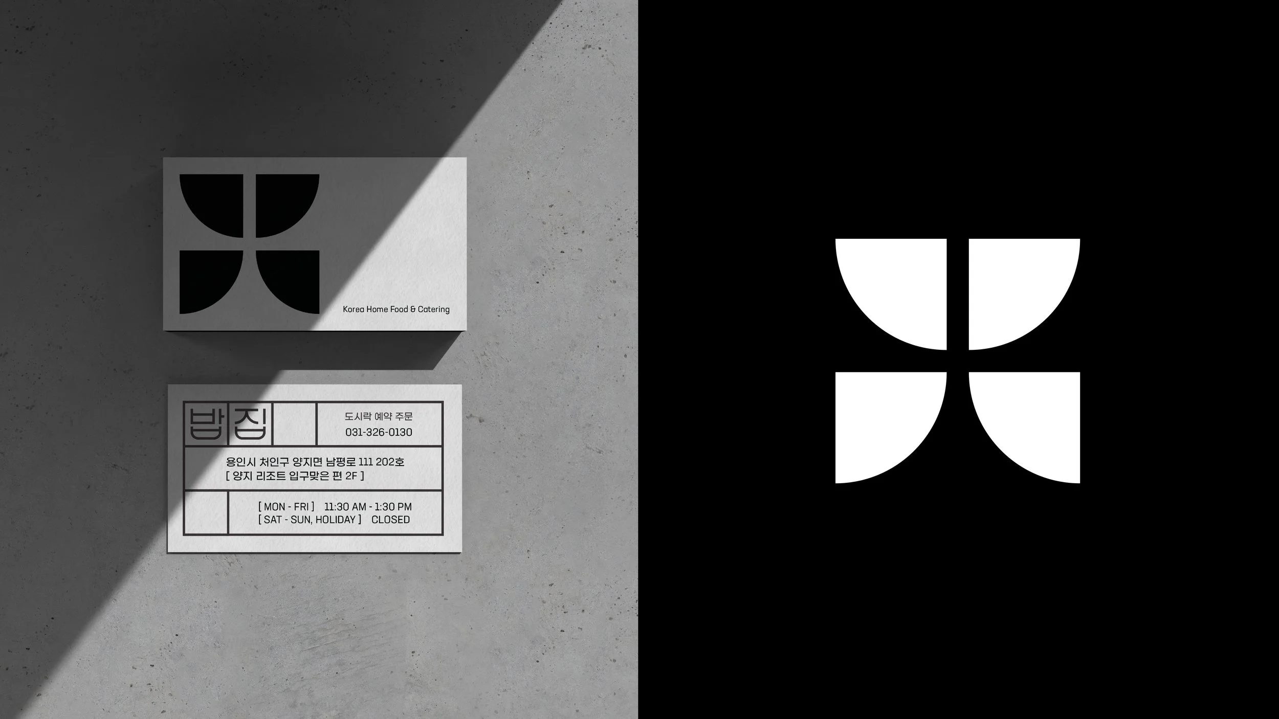
밥집 (Babjip) is an authentic Korean comfort food lunchroom. Babjip is a generic name for restaurants in Korea comparable to the word ‘diner’ in America. Babjip is a self-serve eatery where you control your plate. They provide affordable and convenient experiences for people with an on-the-go lifestyle. The name, Babjip, embodies a simple and honest nature which is exactly what I wanted the logo to convey.
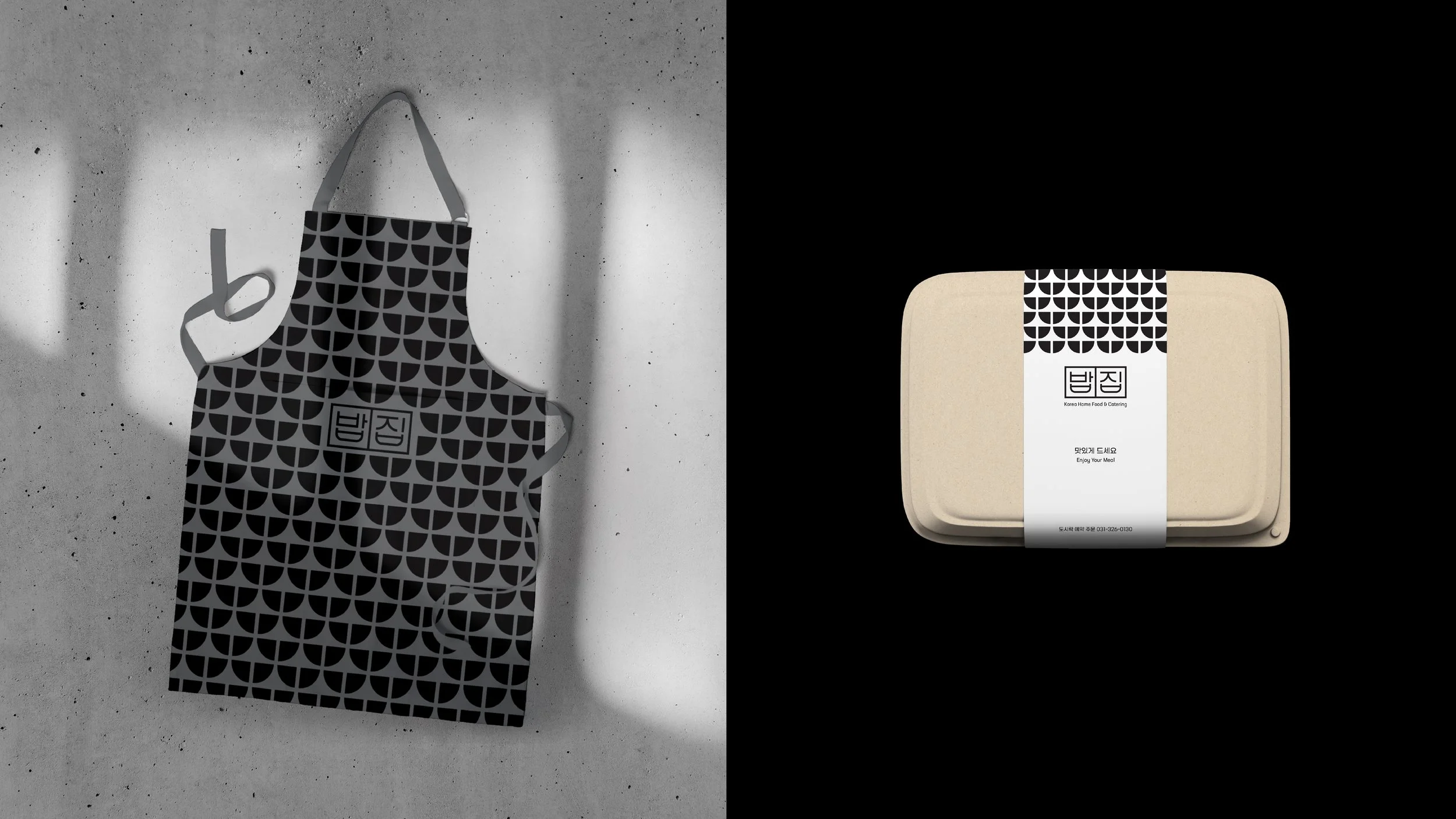
Babjip has one goal, to deliver delightful experiences for people with busy lifestyles by cooking delicious and healthy authentic Korean food. By making the logo in grayscale, it emphasizes their strong will and responsibility in providing quality food consistently.
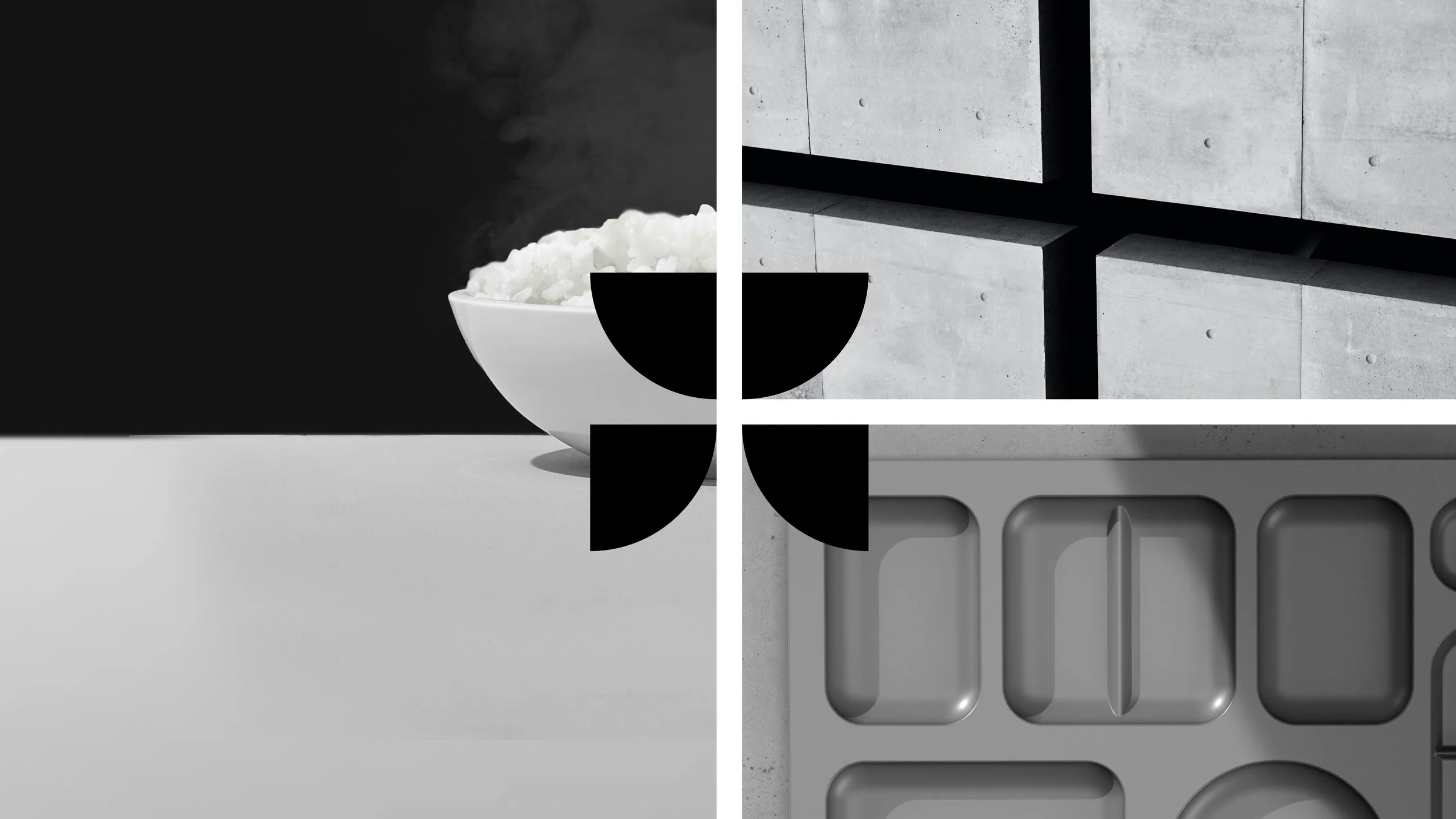
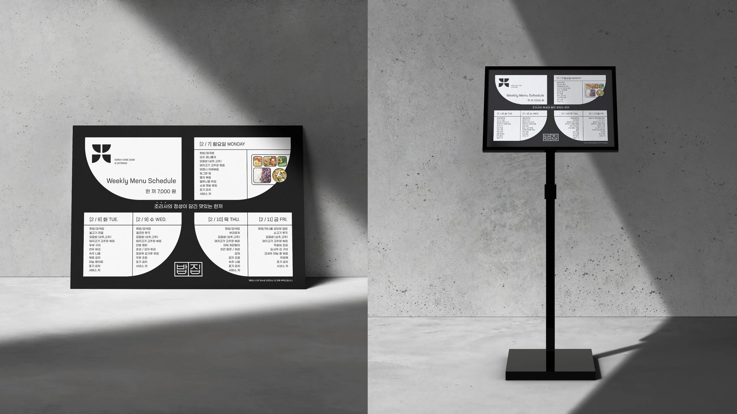
Basic meal in Korea consists of rice and soup which is rooted in deep history. The logo utilizes Korean alphabet ㅂ as a bowl shape that is used to serve rice or soup. The symbol was developed around Babjip's (밥집) consonants ㅂ and ㅈ. They are aligned vertically to visualize a bowl on a table. The grid system in Babjip's symbol was derived from the food tray that customers use to carry multiple food choices. The overall symbol is composed within the square to embody stability, balance, and honesty.


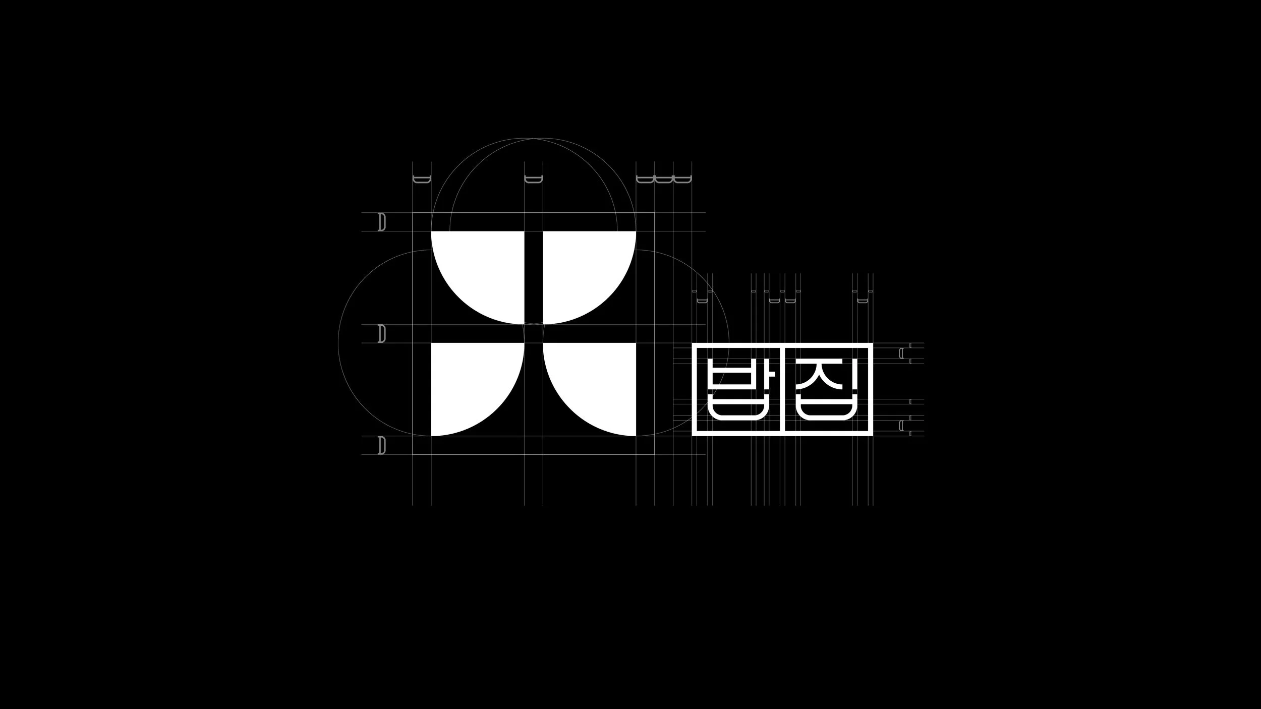


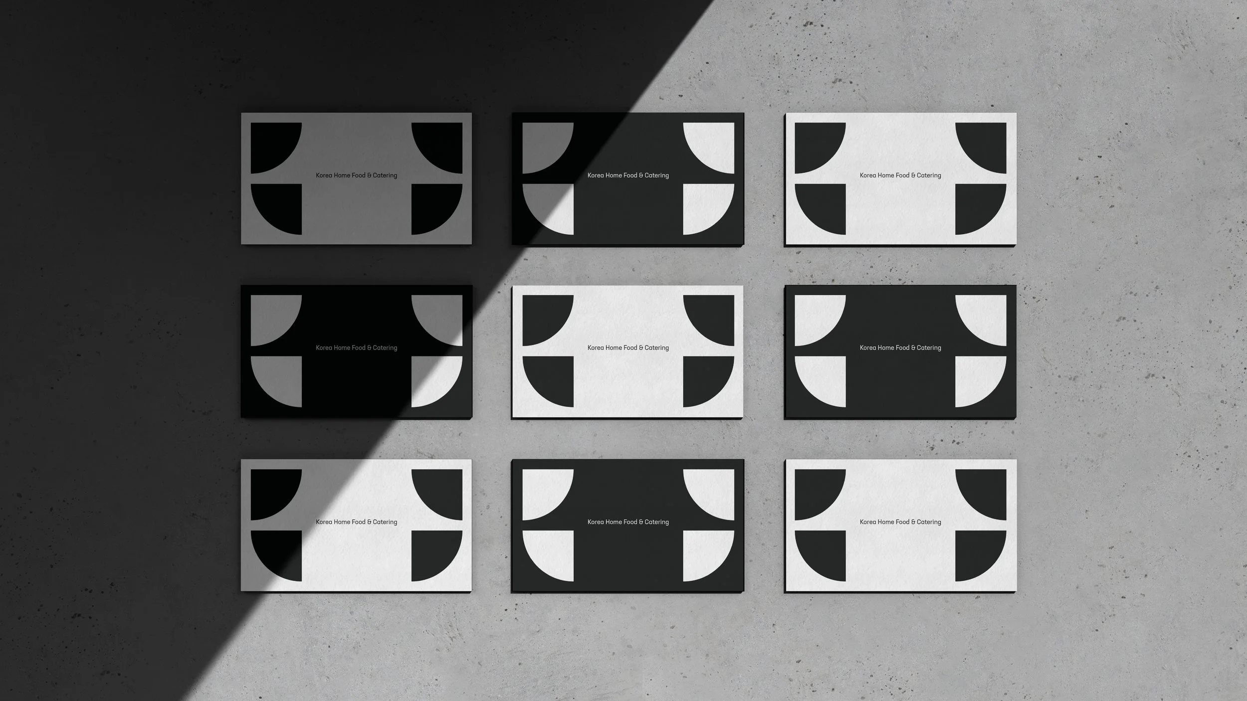
the symbol can be utilized as a pattern. The flexible nature of the symbol allows for multiple pattern applications. It can be stretched vertically or horizontally to enhance the branding.